Monday 24 January 2011

Representation Evaluation

How does your media product represent particular social groups?

The particular counter-culture i am predominantly aiming my magazine at are the 'mods', but categorically speaking; many other aspects of this counter culture come into play. The magazine as a whole is targetted towards working-class white and black people, as elements of reggae and west indian culture combined to create Two Tone and Ska music in the 70's.

Although when the magazine is first produced, it will start with a highly niche market; i anticipate that due to the new coalition government, the counter culture being the mods will rapidly begin to evolve, especially with 'Rudeboy Magazine' inspiring them to.

'Rudeboy Magazine' offers both young, new to Ska people the chance to become a fan of it, especially if they agree with the political policies that go behind the music. Of course, the magazine relates back to the men that experienced the era in the 70's and 80's, involving news and reviews on old musicians that they may have listened to. When i consider my research; as far as i am aware, a Two Tone & Ska magazine was released in the mid-eighties, unfortunately just as the era died down.

Taking demographics and pyschographics into account; I needed to relate to this once powerful counter-culture in terms of style, attitude, interests, and lifestyles. Below is Terry Hall, the iconic lead singer of 'The Specials', of whom i chose to use as a style model for the characters in my magazine.


The image on the left shows Terry in his youth, and how he appears now. He is still heavily influenced by SKA music, as i am fully aware many others are too.

I knew that i needed to relate his character to my own, therefore, i created the lead singer of 'The Stereotypes',(see right) with similar attributes including:
  • Posture- in every single photo i took of my own, i knew it was fundamental to stand loosely, and relaxed, just as Terry Hall in the photo above. I chose not to sit down just as Terry, as i don't want to match the photo exactly. Therefore i chose for my character to stand up with his arms down.
  • Gesture- There are no bodily actions of which connote anger or aggresion, except from a serious facial expression. This gsesture was typical of musicians, therefore of course, i chose to recreate it.This way, the band doesn't connote aggression; as typical SKA and two tone musicians don't act aggresive, they simply create music in anger of political situations.
  • Shot type, Camera angle- A typical camera angle in Ska and Two tone music shoots, is the camera looking slightly downwards on the musicians. This connotes the fact that they aren't powerful, and just like everybody else trying to send a message to the government. Although not shown in my image above, many of my other images, including the one i chose my my front cover image has the typical angle expected in a Two tone magazine.
  • Lighting- after my research, i noticed that many images of Ska musicians such as the above image of Terry Hall, were set in a dark setting, yet given a large amount of light to one area. I recreated this, with many of my photos. I wanted to maintain authenticity of the images, and relate to the genre i am focusing on.
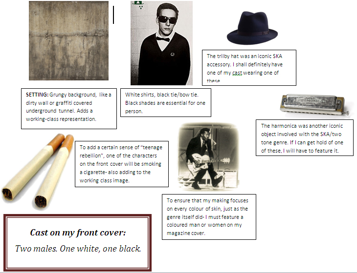
  • Costume- Probably the msot important aspect that i needed to focus on; as the image of a SKA musician was just as important as the music they created. The style associated with Ska music is referred to as 'MOD', with black chino trousers, white/black shirts, brown/black brogue shoes, and accesories including black shades, cotton ties, bow ties, trilby hats and blazers.  Just as Terry Hall, who is a perfect example; i chose to wear black trousers, black shoes, a white shirt and black cotton tie, with black shades. The costume is typical wit any Ska musician, and choosing another option wouldn't have been the right choice.
  • Expression- Also, another very important aspect to be looked at was the facial expressions of my characters. Having a happy, laughing character in my photos wouldn't capture the authentic feel of the real Ska musicians from the past- who were reknowned for their serious, frowning facial expressions. Terry Hall is again, another great example for this, therefore i studied how he uses facial expressions to send a serious tone, and recreated this with my own characters.
  • Hair- The hair of my characters admittadly, wasn't the most of my worries, as i was fully aware of the fact that the musicians such as The Specials didn't particularly care about having slick hair, it was just very messy. Again, i recreated this with my characters.

A few other comparisons-

What setting did you decide to use?
After my research of past Ska music photos, i noticed that often, the background is an urban setting, sending working class connotations of the band- so they can relate to the audience. These urban settings include grungey alleyways, brick walls, and graffitied fences. I chose to take my photos against a brick wall, communicating the working class image of the band, just as other musicians.

Have you used Slang?
Of course, i am aware of the fact that predominantly, my audience are 16-21 year olds, therefore slang language is the obvious choice. Formal text just wouldn't be very coherent to them, and of course, wouldn't suit the image of the magazine. The use of ellipsis, and swear words eliminates the option of euphemism, and uses everyday language that my audience are exposed to.

Have you reinforced stereotypes of your audience (youth) or have you undermined them?
Although being a very niche magazine, i create a situation of were the magazine is being introduced whilst many Ska and Two tone musicians are emerging in the charts. There are many sub-cultures amongst young teenagers to date, such as 'emos' and 'punks', yet i decided to focus on a stereotypical teenager, who likes a whole variety of music.

Have you represented a particular gender, class, or race?
When the two tone and Ska era began in the 70's the audience were predominantly male, therefore i have chosen to focus more on males in my magazine, rather than females, as i am aware that the males will be the people buying my magazine. Two tone music is 'music for the poor' and has been ever since it started; focusing on unemployment and political issues. As i am aware of my typical audience, the chosen class that i focused on was Working class, relating to them through the use of images and language. Finally, two tone music was famous for being multi-cultured. Its name speaks for itself, as it merged both black and white people together, after a time were britain was a very prejudice country.

Rudeboy magazine focuses on subverting stereotypical views of 'mods' in the UK, by communicating political issues, without connoting violence. Of course, Rudeboy represents working class britian in a positive manner, communicating the fact that its a country to be proud of.

Finally, i decided to give Rudeboy a pro-consumerist stance, as i am aware that the audience will be very interested in their clothing and other similar goods. I want to ensure that i don't allow too many pages for advertisements, as of course, the contents comes first. People buy a magazine to read whats in it, not to look at adverts. The sort of adverts which will be featured in my magazine will be brands which are strongly linked to the working class britain, such as Fred perry, beer brands, and taking into account teenagers will be reading; mobile phones.

Monday 18 October 2010

Analysis of College Magazine Questionnaire

I designed and distributed a questionnaire to my fellow students of the East Norfolk Sixth Form College; gaining some vital opinions on what is wanted in a college magazine.
Here is what they had to say:
Over 50% of students revealed that they do not already read the college magazine, as they find the current version “boring”. From this answer, I have gained the knowledge of the fact that there is something wrong with the current magazine, it is lacking in something; which is why I looked further into what they really did want.
Many different aspects of the magazine were requested by the students, especially four particular ones; those being a section for sport, music, college events and jobs. I understood that if these sections were present in the new magazine, students would consider buying it. The big question I then asked myself was, how much would the students be willing to pay? In fact, around 70% of the students chose a price of fifty pence to be an adequate amount to pay. Other prices ranged from nothing at all- to two pounds.  Therefore, from these answers- I gathered that fifty pence would be the most reasonable price to charge for the magazine. It isn’t too expensive; therefore will hopefully not hold back possible sales from students.
Personally, when it came to analysing how often the magazine would be published- I believed that every half term would be a suitable solution. Unfortunately, my opinion was not significant on this matter, what mattered was the students opinion. Generally, the answer for the publishing occurrence was either every fortnight or every month. Over 80% of students selected either one of these answers. This still leaves me with no solution, therefore I decided to even the publish date. Every three weeks. Over a fortnight, yet under a month. Hopefully, due to the magazine not being published so often, I will have a richer content when it is published, so the readers are actually entertained.
Although I already subconsciously knew the answer to the next question, I still needed to clarify. The question to the students was what their favourite thing about each day at college was. To my pleasure, I was correct in thinking that they most enjoyed their breaks, and frees. I also know that the majority of students spend time in either one of the two common rooms, or the smokers shed.  I need to work out where to distribute the magazine, so that the students are aware of it being sold. This means that it would be ridiculous for me to distribute the magazine in somewhere were only a small majority of the students go on their breaks. For example, the library.
As technology spreads across the nation, it would be criminal not to offer an online version of the magazine. It is free for the student, yet still produces money from advertising slots. I personally believed that this would be highly requested, although when asked, 70% of the students said they would not read the online version. From this, I decided that the best approach would be to slowly build awareness and liking of my magazine, instead of introducing a fresh product, with fresh unfamiliar options of access. This way, if the magazine was good enough, (which it will be), the students will make more effort to read the online version.
Another great idea was to offer the option for students to subscribe to the magazine at the start of the year. It guarantees sales, and saves the student money. Unfortunately, 70% of students revealed that they would not subscribe to the magazine. I believe that this was because they have not seen one of the new magazines yet, and are assuming that it will be as “boring” as the old version. Ultimately, I aim to offer a subscription offer after the first year of individual sales. This way, students will know what the magazine is like, and whether or not they like it.
I decided to offer the option for students to contribute their own work to the magazine, this makes the magazine much more personal and it will really connect with the readers. Unfortunately, again, this great idea just didn’t attract the students- almost all that were asked said they would not be interested in contributing.
Finally, a much simpler question was asked to the students. This was whether the magazine would be either formal, or informal. As I assumed, 100% of students wanted the new magazine to be informal, as this way- we can really connect to the reader and not seem “boring”. If we want to make sales on the magazine, it has to be for the students liking.  It will be written informally.
To summarise, the information that I gathered from the set of students really broadened my view on what the students wanted in their fresh college magazine. I will pay close attention to each aspect that they had views on, and present the content in a way which they will appreciate.
My College Magazine Cover


My College Magazine Contents page


Evaluation of my College Magazine

When planning the design of my magazine, i took into account the fundamental aspects that i needed to focus on. These were my target audience, and how i could produce the magazine in a way that appealed to them.
   I decided to approach the appearance and content in a friendly, informal way. I ensured that the appearance was contemporary and had an artistic touch, as many students can relate to art and "cool" work. I decided to use a "fashion aware" student called Elliot to be the centre of attention on my cover! I believe choosing him was a good decision as he is well known around the college and dresses appropriately.
  Using the appropiate tools on Adobe Photoshop ensured that my images all looked the best they could.
On my contents page i decided to have one photo, with all of the page titles listed- with the most important pages being in a larger text to stand out. I added an advertising voucher from the local skatebarding brand SHhh! to attract possible buyers to purchase the magazine, and also buy an item of SHhh! clothing with a 20% off voucher. I am not only advertising SHhh! , but i am increasing sales of my magazine as people would want the 20% off voucher on the clothing. Two jobs done in one!
   To summarise, i think i achieved the magazines purpose in being entertaining, i wanted to set a good first impression from the new and improved magazine.

Analysis of another College Magazine cover


I believed that this specific college magazine cover would be a prime example to analyse after creating my own. Many aspects of the cover all give off connotations of a young, fresh look. I noticed that the college colours are apparent throughout the cover- those being blue and yellow. In this case, the image is not covered largely by text- it is ensuring that the image is the centre-piece, as the

Analysis of two existing music magazine covers

NME
NME magazine is a well-known indie/alternative based magazine intended for predominantly a male audience, from the age of 16 to 25. The covers such as the one shown on the left, host a variety of bright colours and contemporary design features. Usually, the magazine features one particular band which is very popular with its audience at the particular date. In this case, it is “The Wombats”- a well-known indie band from Liverpool. They look like common “indie kids”, which would definitely appeal to the audience; it is a band that they can relate to.
The brand name is filled with a bold red, which stands out to the potential buyer. Other important messages are either written in or surrounded by a bright yellow. Other less important features are in smaller text, in a different colour. In total, this cover contains three photographs. One being the main background image; the other being used to promote an interview with another band, and then a smaller image of a musician in the corner- to acquaint a large feature inside the magazine.
NME generally uses a bold San Serif font to keep the appearance simple yet vogue. A distorted or grungy appearance wouldn’t capture the intended audience that would be associated more to a rock and heavy metal magazine.
This magazine cover does very well in getting a lot of the features across to the viewer in such a small space, they use colours to complement each other and ultimately use the space they have to great effect, varying the font sizes and shapes.

SKA 80
I felt that it was vital to study a magazine based around SKA and Two tone music; the genre I will be focusing on for my particular magazine. This magazine “SKA 80”, was published when the genre was highly popular, and did not carry on publishing once the genre faded out. This magazine is for a very niche market, something I hope to change when I create my magazine.
The iconic SKA checkers are used as a border for the cover, to send the potential buyer a message that all of the SKA music news etc. is contained within the magazine. Many people associate the checkers with SKA and two tone music, therefore without even reading the title of this magazine; I believe that a lot of people would already presume it was a SKA focused product. If I want to capture this iconic style on my cover, it is vital some of these checkers are visible.
This magazine is different to NME, as it doesn’t focus on one particular band to feature- it appears from the cover that every musician and band has their own equal feature within the magazine. I believe that this is because the magazine is very niche, and need to the fill the pages with material.
Bright colours such as yellow and cyan are used in the fonts to make the text stand out. Personally, I don’t believe that this has worked, the colours are almost too bright, with no shadow softening the clashes .
The images on the cover are surprisingly not in greyscale, they are in colour- whereas it would be much more suitable for this genre for the images to be in black and white. I don’t think that the colours have been used to a great effect on this magazine, plus the layout isn’t particularly amazing either.
Analysis of two existing music magazine covers
NME
NME maintains a house style of black white and red; unless the magazine is a special edition, as an allowance of colour change is allowed.  Shown to the left is the image of the classic NME contents page, with one feature image, surrounded by small ads and the highlights of the contents.
The bands highlighted down the spine of the page are in red, so it stands out well against the white background. There is also a small written text about the featured band in the image, so the reader begins to read it, and read more in the forthcoming pages.
NME has cleverly highlighted their most important independent advertisement in a bright yellow font; to attract the reader to subscribing to the magazine. The promotion is on the contents page as it is the most important page in the magazine, NME want their promotion to appear superior and important.
The contents are sub-divided into 5 sections, with extra contents being under a final “plus” section. Page numbers are in a red font, so they stand out to the reader. Also, the use of red is cleverly used in the red arrow in the far bottom right corner, to initiate the reader to begin turning the page, and begin reading!

kerrang!

KERRANG! Have a slightly different colour scheme to NME, hosting black white and yellow as their predominant theme. These colours could connote a bee or wasp, of which sting- an iconic rock star. Magazines often use certain imagery and text to give different connotations to the reader.
On the top left of this contents page, I noticed there Is a note from the editor- which helps the fan base get to know the people behind the scenes and ultimately connect better with the magazine as a whole.
A memorable quote from an interview with “Corey Taylor” invites the reader to open up the pages and read the whole interview feature. This is very clever from KERRANG! Magazine.
In this case, KERRANG has used a large variety of photos averaging the same size, except from of course- the feature photo. The magazine wants to appear very energetic- with lots going on, therefore the contents page is a key place to introduce this.
As with NME, KERRANG’S contents page has a small section in a separate colour to the rest of the page so the promotion stands out, this seems to be very common with the top magazines in the industry.
Analysis of Two Existing Music Magazine feature pages

NME

This double page NME interview with Jamie is a perfect example of how to create a stylish double page spread in a magazine. What I have noticed with NME is that they choose one or two colours for the spread, then use them  scattered around the page to maintain  a “one off” house style. In this case, as Jamie T is a very British modern culture inspired musician, the colours red, white and blue are the perfect choice. See how these colours then occur again where the small text is; only a very small amount yet it attracts the reader’s attention.
The photo has been carefully set up, so that the title can go to the left of Jamie, with the interview on the right. In this case, the photo is the more important than the actual text itself; as the double page is predominantly covered with the image. The image speaks for itself in a way, it oozes with English inspiration- the iconic Harrington jacket and brogue shoes perfectly underline this.
Of course, as with any interview, a small section is copied and enlarged in a different font so the reader has a slight idea of what the conversation will be about; then it introduces them to read the whole text.
NME is known to be a very political magazine; which is justified in this image and text. The fact they have referred to Britain as “BATTERED” is a very negative connotation of the country, whilst the ripped jeans, and altogether negative, working class setting adds to the message. These messages are constantly put into magazines which the readers subliminally understand and gain a political view.
To summarise this double page feature, I love the fact that it is mostly a large photo with a small amount of text; it is almost as if there is a large message in itself from the image.
Disney kids magazine
A variety of vivid colours are present on this “Disney magazine”, featuring “The Jonas Brothers” who have a very large young female audience. The target age ranges from 9-13 and is predominantly female. The layout is typical of a magazine such as this, with a feature image surrounded by many smaller images and brightly coloured text boxes.
Bold headings are used to attract the reader’s attention, using a variety of fonts, and feminine colours. The characters are dressed in a somewhat normal way, targeting no particular sub-culture.  When the term “rock” is used, it is ultimately a strong form of pop-rock, as the young audience will have no specific favourite genre of music except from the latest chart hits.
The main colours present on this feature page are yellow, pink and red- all generally feminine colours. Images appear to be more important than the text as there are many more than there is writing. I believe that this is because the audience will be more interested seeing the picture of the “hot boys” than reading an in depth interview.
Just as with the Jamie T NME interview, a small section is copied and enlarged in a different font so the reader has a slight idea of what the conversation will be about; then it introduces them to read the whole text. It is in bold and in a blue text box, with the actual text surrounding it.
This double pages feature is ultimately present to promote the “camp rock” saga and give a broader view of the characters that the audience wouldn’t understand simply from watching it on television.

Full analysis of NME Magazine

NME is Europe's biggest and most read music magazine. It has earned worldwide respect for its rock music news and features, which are updated around the clock. It offers unparalleled access to an affluent young audience and a unique opportunity to communicate with them in an environment that they relate to and return to frequently - 63% buy the magazine weekly or more frequently*. TheNME audience is made up of key demographic groups that can be difficult to target through other media: -
  • 65% Male*
  • 50% 16-24*
  • 23% 25-34*
  • 79% ABC1*
NME stands for “New Musical Express”, formerly published as a newspaper form yet recently turned into a glossy paged magazine. NME is well known for knowing what is going on in youth culture and obviously what music is popular at the moment. It is also seen at concerts and gigs, renowned as one of the giant names in music.
The logo of the NME magazine is located on the top left of every cover. On average, each main picture on the cover page fills 70% of space. Usually, the main title is situated just under half-way of the page, on top of the photo. The cover page often contains two banners, one on the top, and one on the bottom.
The main colours are red, yellow, black and white. These colours all bold and stand out on the page. These colours are also very recognizable for NME as they are always used.

NME attracts their buyers due to the reasonable price, their stature in the music industry, and the fact that they get the top artists to feature in their magazine. NME staff are well knowledged when it comes to everything teenagers find interesting, therefore NME promote this, with titles such as “review of top 15 rock bands in the last 10 years”
   
Our readers are passionate about music and as a result of their close relationship with the site content they are far more responsive to advertising. Whether they are more positively disposed towards brands that they see as supporting their favourite site or accessing advertising that they see as particularly relevant to them and their lifestyles they are 33% more likely than average to have taken action as a result of seeing an advertisement on the site.

review of media product- Call of Duty: World at War
NME-
It doesn’t matter if you spray and pray, camp in bushes, or generally suck at first person shootem’ ups- the new addition to the COD series will well and truly blow your brains out. Activision have done a superb job of making the game as realistic as ever- with stomach churning graphics and pin-point sound effects. The campaign lets you take on the role of the Yanks and the Soviet Union, as you churn through over 20 gore filled missions. For all you hard core multiplayers, the maps and perks lived up to the pre-release rumours, making the experience even more intense and gripping than Modern Warfare. Joking aside people, this is a must buy- if you’re not attracted to the addictive multiplayer or campaign mode- try the all now horror fest going by the name of “Nazi Zombies”. Trapped in a building, with up to 4 players, fending off endless hoards, of the undead. I don’t know about you, but my spine is already tingling.  Now what are you waiting for? Get your arse down to a store now, before they all run out! Over and out!
OK!-
Ladies, lock up your husbands- the new Call of Duty computer game is out. The controversial series of games will no doubt have many stores in deadlock in the coming days, judging on the amount of sales of the previous episode. There’s not many things which keep a man silent- its either a fresh beer, casual sex, or Call of Duty- statistics which are on all of our lips at this moment in time. The game offers even more barbaric, unmoral situations and graphics which will be sure to get many of our teeth gritting. Of course, this isn’t a review, think of it ladies as more of a- warning. Yes, begin to hear the sound of gunshots 24/7, and the image of blood all over your television screens, COD is here to abduct your partners.
Mood board of Two Tone and SKA audience
Research into Two Tone and SKA audience

Institutional data “overview of industry”
IPC Media produces over 85 iconic media brands, with our print brands alone reaching almost two thirds of UK women and 44% of UK men – almost 27 million UK adults – while our online brands collectively reach 20 million users every month.
IPC's diverse print and digital portfolio offers something for everyone, with a focus on three core audiences: men, mass market women and upmarket women.
Our men's portfolio (IPC Inspire) comprises a wealth of leisure brands including Country Life, Horse & Hound, Rugby World and Decanter, as well as lifestyle brands including Nuts, Mousebreaker and NME.
Our mass market women's division (IPC Connect) comprises famous women's weeklies including Look, Now, Chat and Woman; TV entertainment brands including What's on TV, TVTimes and TV & Satellite Week and, online, the goodtoknow network.
Our upmarket women's division (IPC Southbank) comprises luxury fashion brands including Marie Claire and InStyle, lifestyle brands including woman&home and essentials and home interest brands including Ideal Home, Livingetc and housetohome.
From this information, I have acquired the knowledge that the IPC media corporation is one of the few major producers of magazines. New magazines entering the market often turn to a company like this, to produce the magazine in large batches- yet IPC gains a certain amount of profit. If I was to publish my SKA magazine in the UK, I would need to run the design and features past a company such as IPC to ensure it was suitable to be printed. Magazines are often much more trusted if they are produced from a well-known, reliable company such as this.

Institutional data “Music Magazine”
You know us. We're the NME. We're a weekly magazine that's a must for right–thinking music fans. And very wrong–thinking music fans. We have the best access to your favorite bands. We have the greatest music writing and photography. We're the ultimate source for discovering the best new music first. We also give to charity.
In our pages recently you'll have read about Klaxons meeting God via drugs, Bombay Bicycle Club unsuccessfully busking in Ibiza, Jack White's war on the internet, Arcade Fire's financial woes, Liam Gallagher revealing his Beady Eye. This stuff happens every week.
In a world drowning in musical disinformation we're shit–shoveling Vikings, clearing the path for your festivals of wine and song.
NME comes out every Wednesday and it's priceless. Well, it's £2.30, but you get what we mean.”
Key Facts
Price £2.20
Frequency Weekly
Circulation 56,284
Readership 411,000
Launch Date 1952
Male/Female 73%/27%
Average Age 25
ABC1 73%
Target Market Men 17-30
Above is a prime example of the statistics given for a well-known music magazine; NME. It can clearly specify who its predominant audience is. IPC publish this magazine. The magazine has been going for over 60 years which means that it is well established and trusted. The genres of music that it covers are indie, rock, alternative and folk.
what I need for my music magazine


Looking back at your preliminary task (the college magazine task), what do you feel you have learnt in the progression from it to full product?


Covers (Before)                                                          (After)


Contents (Before)                                                   (After)


From the preliminary task (college magazine), to the main task (music magazine), I learnt a variety of methods and tools on the program 'Adobe Photoshop CS5'. 


Before i even started the preliminary task, I already had basic skills with photoshop, which is presented in the cover and contents. I understood the fundamental issue of the 'layers', and shape/font tools etc.


Throughout the process of designing my music magazine, I frequently watched 'Photoshop advanced tutorials' on Youtube, which taught me valuable advanced skills which allowed me more freedom when it came to putting together the task. These skills ranged from a deeper understanding of the manipulation tools, plus 'rasterizing layers' etc. I was already aware of intermediate tools such as the blending modes, and transformation options.


4 particular photoshop tools of which had a good effect were as follows:

  • The 'stroke' tool- I used this sub-option after spending a long while searching for it. The tool made it possible for me to add a black rim around my font, which was fundamental in adding to the image of SKA and Two Tone. I could alter the width of the stroke for example, giving me alot of freedom in how i presented my text.
  • The 'paste into' tool- I used this method to create my title for Rudeboy. I somehow needed to merge in the Union Jack, to again add to the patriotic message the magazine sends. The 'paste into' tool allowed me to place the flag into the font, and alter its position. I am glad that i learnt how to do it, as it is a very valuable tool to use.
  • The 'gradient' tool- This was very useful to me as it added a contemporary feel to the cover. I learnt how to alter the gradient with colours and perspective, and used it as a background for the magazines introduction.
  • A variety of 'Blending options'-  This allowed me to paste in a certain texture, and overlay it on certain images. Such as the one on the contents page. This creates a vintage effect, and adds of course, more texture to the page.

In my preliminary task, I addressed my audience in a neutral tone, due to such a variety of culture within the college. Therefore, with the knowledge of the age range, i spoke in 'slang language' which is used from day to day. On the other hand, with my music magazine, I addressed my audience with much more precision, considering that my audience is a very niche one. 

For both covers, i was aware that my image should only fill 2 out the 3 columns that the page is divided into, with my college cover being filled in the middle and the right; whilst my music magazine filled the left, and the right, leaving the middle column blank for text.

Before my preliminary task i didn't study many magazines on the market- and my naivety is promoted in the two pieces that i created. Yet, after heavily analysing a variety of different music magazines, i began to pick up some interesting pieces of detail of which would make my main task even more proffessional. For example, the note from the editor.


I took feedback from my preliminary task, from fellow students and my tutor, and made improvements on that when creating my music magazine. I can particularly remember my media teacher telling me to have a bold title on the front of the magazine, of which i didn't have in my college magazine.


    What have you learnt about technologies from the process of constructing this product?


    Throughout the entire process of creating my media AS coursework, i have used a range of programs. The programs I used were:


    Adobe Photoshop CS5


    I used this program to ultimately cover the whole creative aspect of the coursework, as it had every tool that i needed to create the highest quality of work.


    Advantages-


    The program is available at the college, and is regarded as the most advanced and best photo editing software. It covers every possible option in regards to editing and creating. I already knew how to use it, therefore it was all very coherent for me. It also gives the option to save in a large variety of formats.


    Disadvantages- 


    For first time users, the complexity of it may be hard to grasp, plus it does occasionally 'lag', and hide certain bars down the right hand side, which is a pain to recover. Other than that, the program is pretty much faultless, yes- Adobe continue to publish more and more editions. For people using it at home, it is a very expensive piece of kit, costing around £160.


    What I Learnt-


    I learnt to consider aspects of photos such as camera angle, shot distance, composition and location. Plus of course, many of the tools to manipulate the photograph.


    Flickr


    This web program allowed me to post annotations on my magazine pages, making my evaluations very coherent. I could then post these photo links onto my blogger.
    Advantages-


    The program has a wide range of options to categorize and annotate your images; it is of course free, and a reliable website for posting your portfolios of work.


    Disadvantages-


    The site isn't very coherent to navigate around, plus I needed to create a yahoo email address to use it.


     Blogger


    As you may have guessed, i used Blogger as it is a free yet officient blogging program, allowing me to cover all the aspects of my coursework and write explanations for different aspects of the course.    


    Advantages-


    The website is free, and simple- it allows any format to be placed onto the blog, and has the option to add photos and videos etc; which is very helpful.


    Disadvantages-


    On a number of occasions, i have lost large amounts of work, as it has simply 'dissapeared' off of my blog.


    How did you attract/address your audience?


    I recognized that it was fundamental for me to address the audience in a language they are used to. Considering their interests (see mood board) I noticed that the audience is predominantly male, therefore i addressed them in a crude, informal tone. I avoided euphemisms, and included political statements, such as 'broken society we live in'. The style of the magazine as a whole would attract the audience as it is very commercial and bold, with no feminine colours present.


    I believe someone would want to be associated with RUDEBOY, as it is patriotic, and rebelling against the new coalition government. Ultimately, anybody that doesn't agree with the society we live in.


    Please click the links below to read the annotations on the cover, contents, and double page spread.


    Cover- http://www.flickr.com/photos/59388796@N08/5430329355/


    Contents- http://www.flickr.com/photos/59388796@N08/5430936600/in/photostream/


    Double page spread- http://www.flickr.com/photos/59388796@N08/5430937382/in/photostream/

    In a nutshell, the audience is ultimately addressed with a subject they are interested in; being SKA and Two Tone music; otherwise, why would they buy the magazine? The unique selling point of the magazine is that it is the only one of its kind, focusing on the certain genres, plus it is heavily politically inspired, yet without being tedious.


    I aim to address the audience with advertisements from beer brands, Fred Perry, and pretty much anything English. This way, it adds a sense of patriotism,  and refers back to the fact that we are brought of our nationality.


    I constantly asked for feedback throughout the designing process. Luckily, my media teacher is from Coventry, so he had many things to say when it came to the content, and the style. I always acted upon this feedback, in aim to improve my magazine even further.